4.12 Scatter Graphs GCSE PowerPoint Lesson
£2.00
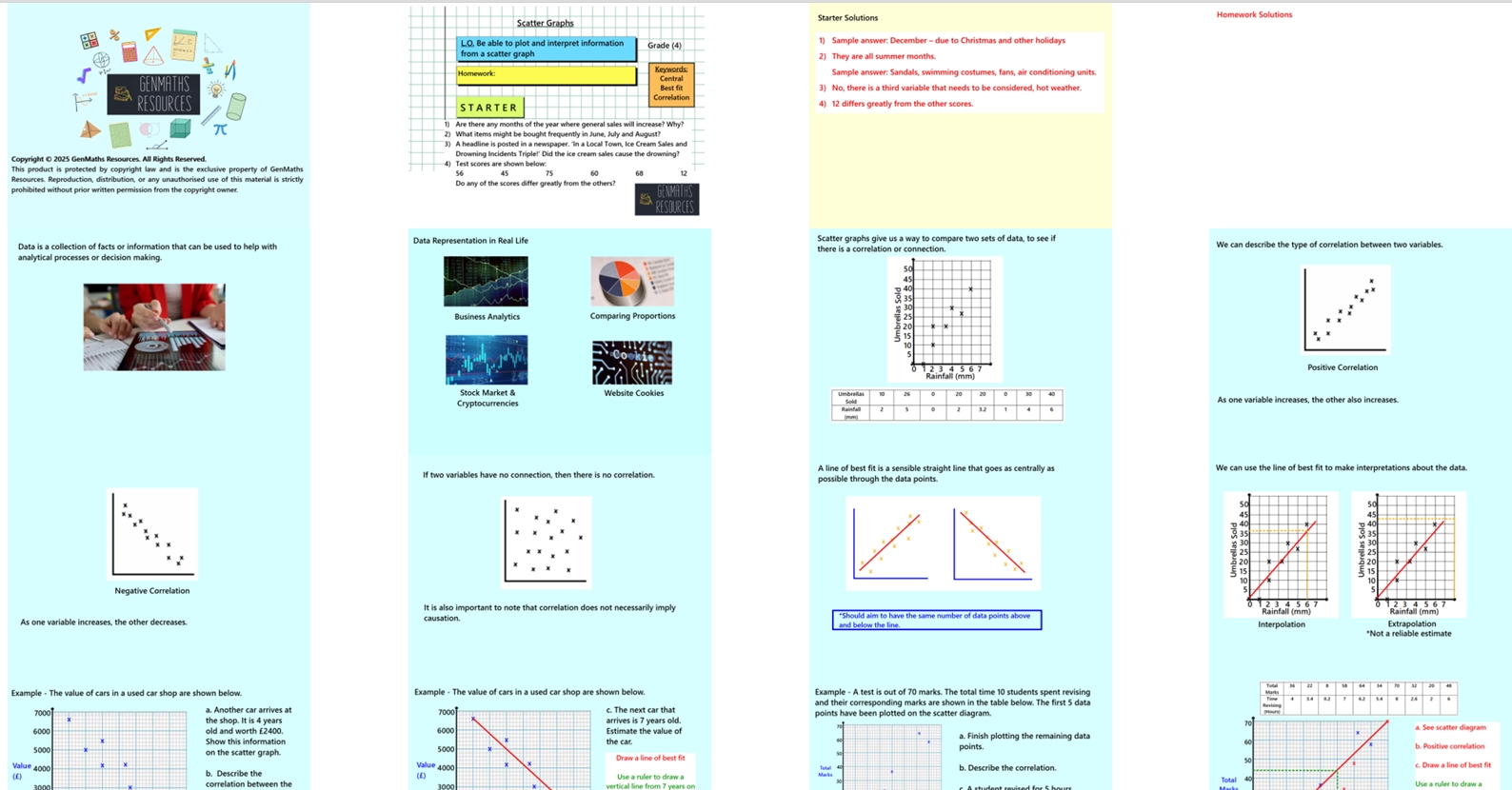
In this 24-slide lesson, pupils will plot pairs of numerical data on a scatter graph to investigate relationships between variables. They will learn to describe types of correlation (positive, negative, or none) and draw lines of best fit where appropriate. Pupils will also make predictions based on the trends they observe. Discussions around interpolation, extrapolation and their effectiveness is also discussed.
The lesson includes:
Clear, guided examples
Discussion opportunities from Think, Pair, Share
Mini whiteboard section to check understanding and clarify misconceptions
One structured task to practise key skills
Challenge activity to extend and deepen learning
Perfect for engaging learners while reinforcing essential data and statistics concepts.