4.22 Box Plots Higher GCSE PowerPoint Lesson
£2.00
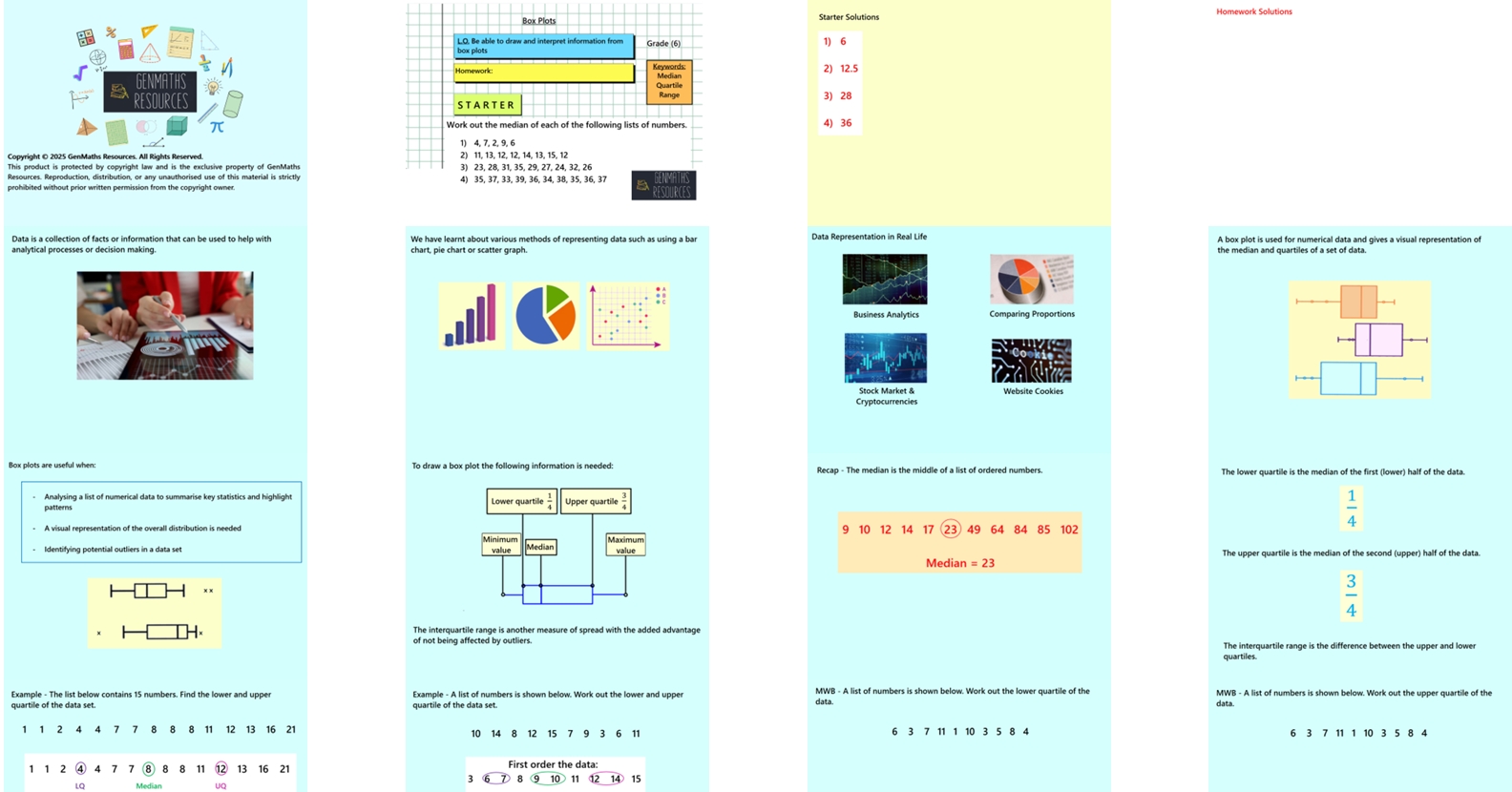
This 37-slide lesson introduces students to box plots as a method of visually representing data distributions. The lesson begins with a focus on finding key statistical measures — including the lower quartile, median, and upper quartile — from a list of numbers. Students will use these values, along with the minimum and maximum, to construct accurate box plots. The lesson includes worked examples, scaffolded practice, and opportunities for reasoning and comparison. Emphasis is placed on precision, interpretation, and making meaningful comparisons between data sets. Pupils will learn to both draw and interpret box plots, including from cumulative frequency diagrams.
There are printable worksheets at end of lesson that coincide with slides.
Note this lesson is for the higher tier only.
The lesson includes:
Clear, guided examples
Discussion opportunities from Think, Pair, Share
Mini whiteboard section to check understanding and clarify misconceptions
Two structured tasks to practise key skills
Challenge activity to extend and deepen learning
Perfect for engaging learners while reinforcing essential data and statistics concepts.