4.23 Histograms Higher GCSE PowerPoint Lesson
£2.00
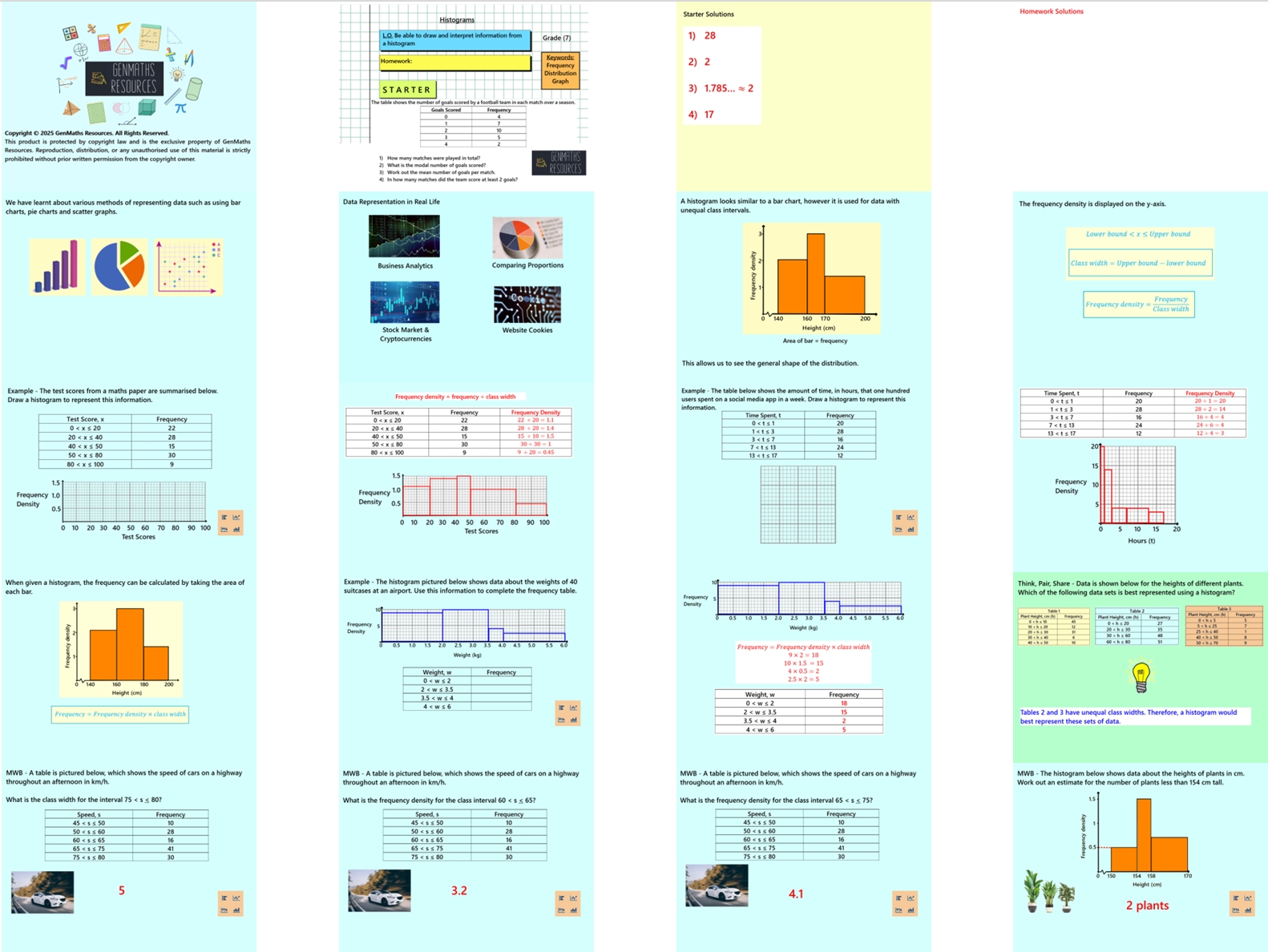
This 27-slide lesson introduces students to histograms as a method of displaying continuous, grouped data. Students will learn the key differences between histograms and bar charts, focusing on how class width affects the height of bars. The concept of frequency density will be introduced and used to construct accurate histograms. Pupils will understand when and why histograms are used, draw histograms accurately (taking class width into account), and interpret histograms to describe data distributions.
There are printable worksheets at end of lesson that coincide with slides.
Note this lesson is for the higher tier only.
The lesson includes:
Clear, guided examples
Discussion opportunities from Think, Pair, Share
Mini whiteboard section to check understanding and clarify misconceptions
One structured task to practise key skills
Challenge activity to extend and deepen learning
Perfect for engaging learners while reinforcing essential data and statistics concepts.